
The dashboard was green.
The warehouse had picked on time. The carrier had departed on time. The paperwork had been accepted. The receiving team was staffed. Every responsible unit had met its target.
The equipment still arrived after the operation had begun.
Nothing on the dashboard was false.
The dashboard simply measured the success of the pieces while the system failed between them.
Green is comforting
Management dashboards promise something deeply attractive: a complicated organisation reduced to one calm screen.
Green means fine. Amber means pay attention. Red means somebody will spend the afternoon explaining why red is technically amber when viewed against the revised baseline.
I understand the attraction. Complex work needs compression. A director cannot read every maintenance log, warehouse record, ticket, incident note and field report. A useful dashboard can reveal trends, exceptions and pressure before they become failure.
The problem is not the dashboard.
The problem is believing the dashboard is the operation.
Components report upward. Outcomes happen sideways.
Most organisations divide ownership vertically.
Procurement owns the contract. Logistics owns delivery. ICT owns the system. Finance owns the payment. Operations owns the task. Each unit reports through its own chain, against measures it can influence.
But the user experiences the result horizontally.
The user does not care that the purchase order was issued within target if the item is unavailable. A television audience does not care that the studio, link and transmitter each reported healthy status if the programme is silent. A traveller does not care which contractor met its service level if the train does not move.
Every vertical box can be green while the route across them is broken.
This is how organisations achieve local success and collective failure.
Averages remove the person who had the problem
Dashboards also love averages.
Average response time. Average availability. Average cost. Average delay.
Averages are useful, but they are talented at hiding the exact thing that matters.
Ninety-five per cent availability sounds excellent until the unavailable five per cent contains the only asset configured for a critical task. An average delivery delay of two hours sounds manageable until one shipment arrived three days late and the rest were early. A help desk can meet its average response target while a small group of difficult cases waits for weeks.
The average is not lying.
It is answering a broad question when the decision depends on a narrow one.
Colour becomes political
Once a dashboard reaches senior management, colour stops being a description and becomes a career event.
Red attracts meetings, requests for explanation and promises of recovery. People learn to delay red. They adjust thresholds, redefine milestones, create recovery plans or add narrative explaining why the indicator is temporarily outside tolerance but remains strategically on track.
By the time an indicator becomes officially red, the people closest to the work may have known about the problem for weeks.
This is not always dishonesty. Often it is self-defence. If early warning produces blame rather than help, staff will wait until the evidence is unarguable.
A dashboard built for escalation then becomes a dashboard built to avoid escalation.
A good dashboard starts with the mission
The first question should not be, “Which data do we have?”
It should be, “What must work?”
If the mission is to place usable equipment in the hands of a team by Tuesday, then the measure must follow that whole promise. Picked on time, dispatched on time and received on time are supporting facts. The outcome is usable equipment, in the right place, before it is needed.
A strong dashboard then adds what management actually needs:
- the outcome, not only component activity;
- exceptions that can change the outcome;
- trend, rather than a single frozen value;
- confidence in the data;
- the owner of the next action;
- the decision or support required.
It may still use green, amber and red. Colours are not the enemy. Unearned confidence is.
Leave room for a sentence
One of the most useful additions to a dashboard is a short human assessment.
Not a paragraph designed to neutralise the colour. A sentence from somebody who understands the work:
Availability is 94 per cent, but two of the unavailable vehicles carry the only winter kits for the northern deployment. If repairs slip beyond Wednesday, the operation will start without full capacity.
The number tells you the state.
The sentence tells you the meaning.
Both are needed.
The screen is an invitation
A dashboard should make the next question obvious.
Why did this change? What is hidden by the average? Which dependency is outside the reporting line? What must be decided today? What would make us wrong?
If the screen closes the conversation, it is probably creating reassurance rather than understanding.
I like green. Green is pleasant. Green allows lunch.
I just prefer it to mean that the work is actually working.
Because when every box is green and the operation still fails, the problem is not bad luck.
The dashboard measured the organisation chart.
Reality took another route.
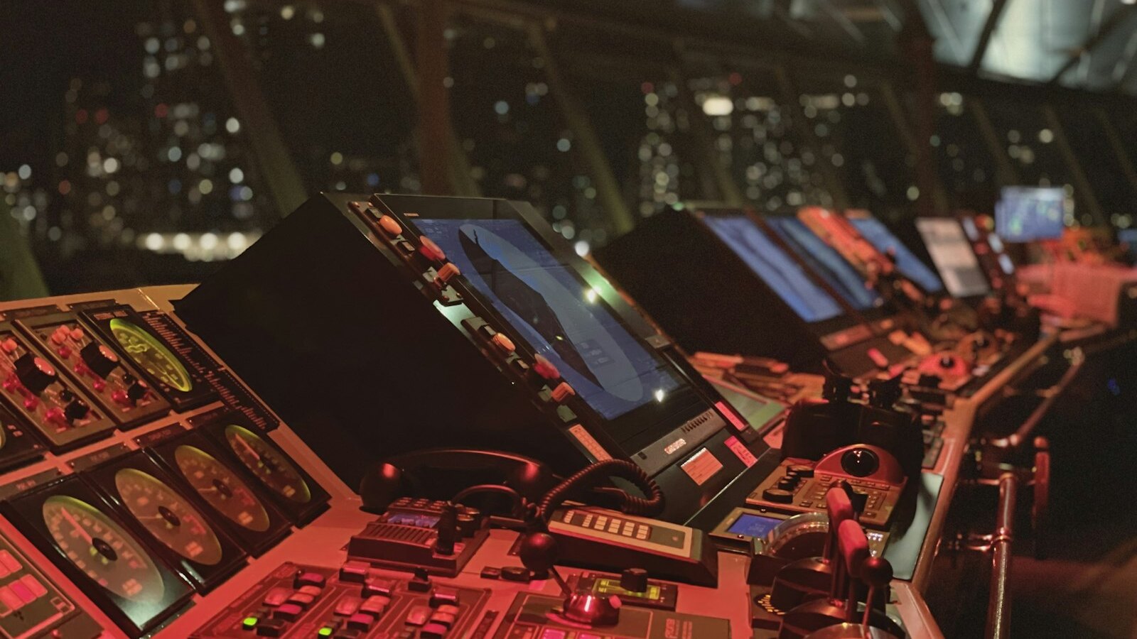
Hero photograph: a ship's navigation bridge by Tom Donders / Unsplash. Cropped for web display.
Original photograph →
Reader discussion
Join the discussion
Comments are moderated. Disagreement and strong opinions are welcome. Spam, threats and personal abuse are not.